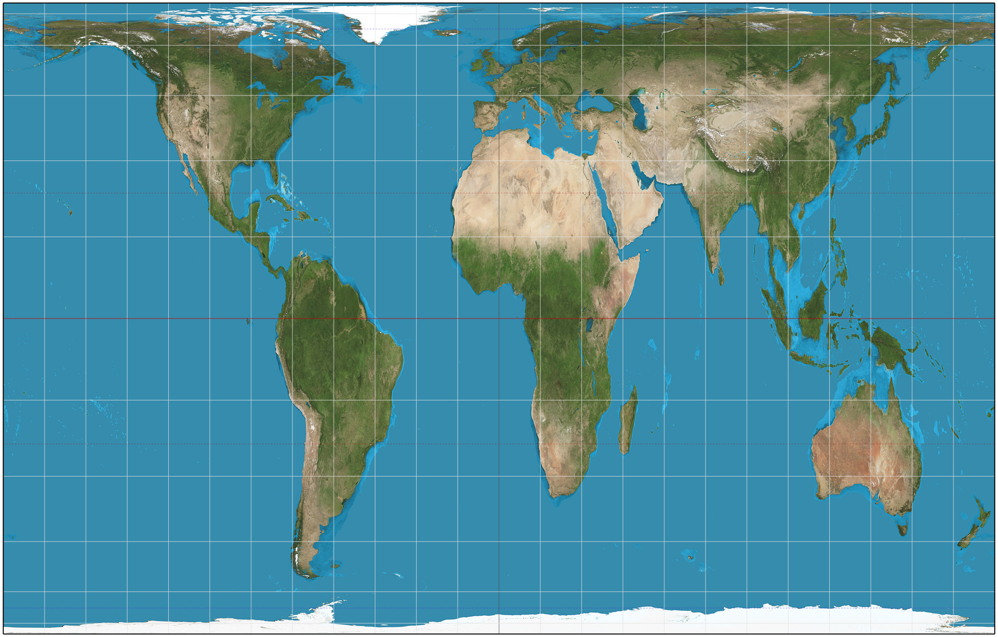

A "new" map that was already 118 years old
James Gall, a Scottish clergyman with a serious interest in cartography, presented an equal-area world map projection at the 1855 meeting of the British Association for the Advancement of Science in Glasgow, one of three projections he showed off that year. He called it the "orthographic" projection and didn't formally publish the mathematics behind it until 1885, in the Scottish Geographical Magazine. It attracted little attention and stayed a minor entry in projection catalogs for well over a century.
Working independently and apparently unaware of Gall's paper, German filmmaker and self-described historian Arno Peters arrived at nearly the same projection in 1967 and unveiled it at a 1973 press conference as the "Peters world map," presenting it as the first genuinely fair map of the world. There was an odd wrinkle in his own math: Peters's written description of the projection, taken literally, defined standard parallels at 46°02′ N/S rather than the 45° he clearly intended based on his accompanying text, a small error that happens to make almost no visible difference on a world map but meant the "new" projection wasn't even correctly specified on its own terms. Cartographers noticed the deeper problem in the aftermath of that 1973 press conference: the underlying mathematics was Gall's, unattributed. Peters did not publicly acknowledge Gall's prior work until late in his own life, after the controversy had largely run its course.
The professional response arrived in print in 1985, when geographer Arthur H. Robinson reviewed Peters's claims in The American Cartographer, the journal of the American Cartographic Association. That review is the source of cartography's most quoted put-down of the map: Robinson wrote that its landmasses were "somewhat reminiscent of wet, ragged, long winter underwear hung out to dry on the Arctic Circle." The line stuck; a 2003 academic retrospective on the fight in the journal Geography borrowed it outright for its own title: "Long Underwear on a Line? The Peters Projection and Thirty Years of Carto-controversy." A year later, in a 1986 pamphlet the American Cartographic Association put out to help the public sort through the dispute, Robinson used the compound name "Gall-Peters projection," crediting both men, and that's the name that stuck in professional use.
What "equal area" actually costs you
No flat map can preserve a sphere's shapes, areas, distances, and angles all at once; every projection has to pick which of those properties to sacrifice, and by how much. Gall-Peters picks area. Wherever you look on the map, a region's size relative to the whole map matches its true size relative to the whole Earth, which is a real and useful property, especially for anyone trying to compare countries at a glance.
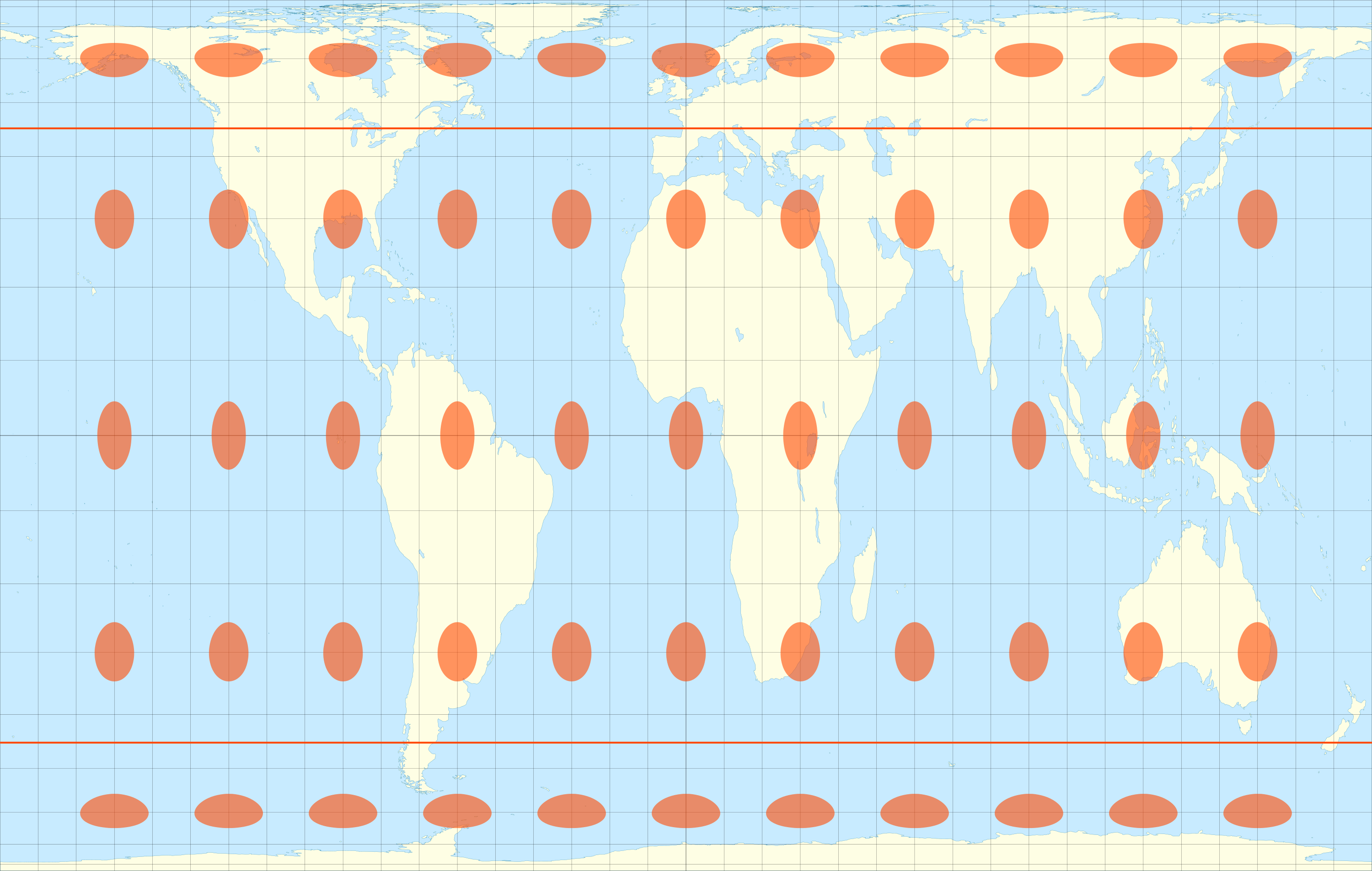
The cost shows up in shape. The projection has exactly two "standard parallels," at 45° north and 45° south, where distances and shapes come out correctly. Everywhere else, the math has to compensate: local stretching in one direction is balanced by compression in the other to preserve area, with the directional scale factors varying by latitude. Near the standard parallels the distortion is mild. Near the equator, where most of the world's tropical and equatorial nations sit, landmasses get squeezed horizontally and stretched vertically into unnaturally tall, narrow shapes; near the poles, the opposite compression happens. A visualization using Tissot's indicatrix, a standard cartographic tool that plots identical circles across a projection to reveal distortion, shows every one of those circles keeping the same area on Gall-Peters, exactly as the projection promises, while their shape stretches into narrow ellipses the farther they sit from the 45° lines. Pinpointing an exact spot on a curved Earth can matter just as much as choosing a projection: Point Nemo's exact coordinates were calculated in 1992 using purpose-built GIS software, marking the single ocean point farthest from any coastline.

This is the part of the controversy that had nothing to do with politics: professional cartographers had known for over a century that equal-area projections existed and that shape distortion was the unavoidable price, and hundreds of alternative equal-area projections had already been described before Peters arrived. What made his version distinctive wasn't the mathematics. It was the argument he built on top of it.
A different recording medium appears in the quipu system used for Inca administration. A study matched numerical cord records to a 1670 document naming 132 taxpayers. That example concerns how information was recorded and recovered; it does not show that quipu necessarily sacrificed written detail, or that its limits were the same as a map projection's geometric distortions.
The real numbers behind the Mercator complaint
Gerardus Mercator designed his 1569 projection for navigation: a straight line drawn anywhere on a Mercator map holds a constant compass bearing, which made it genuinely valuable for sailors plotting a course. The tradeoff is that it inflates area dramatically as you move away from the equator, since it has to stretch east-west distances to keep bearings straight and stretch north-south distances to match, compounding the farther a place sits from the equator.
The often-cited comparison holds up: Greenland covers about 2.17 million square kilometers, while Africa covers roughly 30.37 million square kilometers, nearly 14 times larger. On a standard Mercator map, the two look close to the same size, because Greenland's high latitude inflates it while Africa's position straddling the equator keeps it comparatively true to scale. Peters built his entire argument around exactly this kind of gap, and it's the part of his case that professional critics never seriously disputed.
What critics disputed was the framing. In his book The New Cartography, Peters didn't just argue that Mercator distorted area; he argued cartographers had defended that distortion out of institutional self-interest, writing that "by the authority of their profession, cartographers have hindered its development. Since Mercator produced his global map over four hundred years ago for the age of European world domination, cartographers have clung to it." He also overstated his own map's virtues, at various points describing it as possessing "absolute angle conformality" and being "totally distance-factual," claims that were straightforwardly false and that gave critics an easy opening to dismiss the whole project rather than engage with the area-distortion point underneath it. The framing worked on a different audience than the cartographers: the National Council of Churches and the magazine New Internationalist both adopted the map in the years after 1973, and UNESCO began promoting maps based on the projection in its own materials.
Political terminology can also change its use. Mutually Assured Destruction began as a critical term in 1962 and later became widely used in discussions of nuclear deterrence. That history is a separate example of changing reception, rather than evidence that a map and a strategic doctrine followed an identical path.
From a 1989 cartographers' revolt to a 2024 Nebraska law
The professional pushback eventually became organizational. In 1989 and 1990, seven North American geographic societies adopted a joint resolution rejecting the use of any rectangular projection, Mercator or Gall-Peters alike, for general-purpose world maps, urging publishers and government agencies to stop using either for anything but specialized applications. The North American Cartographic Information Society notably declined to endorse it, a reminder that even the professional camp wasn't unanimous.
The classroom fight, meanwhile, kept going. Boston Public Schools began phasing Gall-Peters maps into second, seventh, and eleventh-grade classrooms in March 2017, and the district said it was the first public school system in the country to make the map its standard. Hayden Frederick-Clarke, the district's director of cultural proficiency, connected the switch directly to who was in the classroom: eighty-six percent of Boston's students were students of color, many with family ties to countries the Mercator map renders undersized. Sixteen years earlier, before any real school district had done this, NBC's The West Wing had already dramatized the identical fight: in a February 28, 2001 episode, a fictional advocacy group called the Organization of Cartographers for Social Equality lobbies the fictional White House press secretary to require Gall-Peters maps in every American classroom, making the same demographic argument Boston would make for real a decade and a half later.
The most recent chapter came from an unexpected direction, and it took a legislative detour to get there. State senator Justin Wayne introduced a bill, LB 962, requiring Nebraska public schools to use only Gall-Peters or AuthaGraph maps; that standalone bill was later indefinitely postponed, but its exact language survived by being folded into a different, broader education bill, LB 1329, through floor amendment AM2831. On April 16, 2024, Nebraska Governor Jim Pillen signed LB 1329 into law, banning Mercator-projection maps from Nebraska public school classrooms starting in the 2024-2025 school year and requiring schools to display a Gall-Peters map, another cylindrical equal-area projection, or the AuthaGraph projection instead. A fight that started in 1973 as a left-coded critique of colonial-era cartography had, fifty-one years later, become state law in a legislature controlled by the opposite end of the political spectrum, over an argument about accuracy that both sides, by then, agreed on.